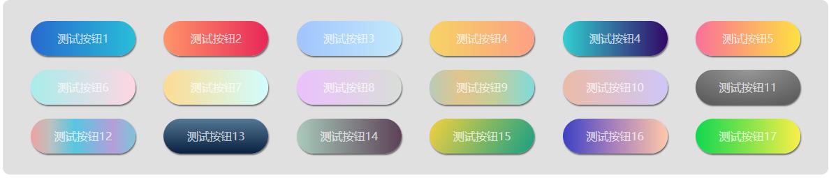
.box {
width: 60%;
margin: auto;
background-color: rgba(204,204,204,.6);
padding: 20px 20px;
border-radius: 10px;
display: flex;
flex-wrap: wrap;
justify-content: space-around;
}
.button {
width: 150px;
height: 50px;
line-height: 50px;
border-radius: 100px;
text-align: center;
color: rgba(255,255,255,.7);
box-shadow: 1px 2px 2px #666;
margin: 10px;
}
.button:hover {
opacity: .7;
}
.one {
background: linear-gradient(-90deg, #29bdd9 0%, #276ace 100%);
}
.two {
background: linear-gradient(to right, #ff9569 0%, #e92758 100%);
}
.three {
background: linear-gradient(to right, #a1c4fd 0%, #c2e9fb 100%);
}
.four {
background: linear-gradient(to right, #f6d365 0%, #fda085 100%);
}
.five {
background-image: linear-gradient(to right, #30cfd0 0%, #330867 100%);
}
.six {
background-image: linear-gradient(to right, #fa709a 0%, #fee140 100%);
}
.seven {
background-image: linear-gradient(to right, #a8edea 0%, #fed6e3 100%);
}
.eight {
background-image: linear-gradient(to right, #fddb92 0%, #d1fdff 100%);
}
.nine {
background-image: linear-gradient(to right, #ebc0fd 0%, #d9ded8 100%);
}
.ten {
background-image: linear-gradient(to right, #e4afcb 0%, #b8cbb8 0%, #b8cbb8 0%, #e2c58b 30%, #c2ce9c 64%, #7edbdc 100%);
}
.eleven {
background-image: linear-gradient(to right, #ebbba7 0%, #cfc7f8 100%);
}
.twelve {
background: linear-gradient(to bottom, rgba(255,255,255,0.15) 0%, rgba(0,0,0,0.15) 100%), radial-gradient(at top center, rgba(255,255,255,0.40) 0%, rgba(0,0,0,0.40) 120%) #989898; background-blend-mode: multiply,multiply;
}
.thirteen {
background-image: linear-gradient(to right, #eea2a2 0%, #bbc1bf 19%, #57c6e1 42%, #b49fda 79%, #7ac5d8 100%);
}
.fourteen {
background-image: linear-gradient(to top, #09203f 0%, #537895 100%);
}
.fifteen {
background-image: linear-gradient(to right, #a8caba 0%, #5d4157 100%);
}
.sixteen {
background-image: linear-gradient(-60deg, #16a085 0%, #f4d03f 100%);
}
.seventeen {
background-image: linear-gradient(to right, #3b41c5 0%, #a981bb 49%, #ffc8a9 100%);
}
.eighteen {
background-image: linear-gradient(to right, #0fd850 0%, #f9f047 100%);
}